Table of Contents
Getting Started with Feathers
In the following beginner-level tutorial, we'll create our first Feathers Button control. This is a very simple demonstration that sets a label, adds an event listener, and creates a theme that will apply a skin.
Prerequisites
- You should understand how to set up a regular Starling project. Please start with the Starling guides and tutorials, if you're new to Starling.
- Check the Introduction section of the Feathers documentation for instructions on how to add Feathers to your favorite development environment.
- Look inside the
themesdirectory of the Feathers ZIP file to findMetalWorksMobileTheme.swc. Add it to your project's build settings the same way that you addedfeathers.swc. - The complete source code for the Hello World example is included with Feathers in the examples directory, so please feel free to follow along.
Final Result
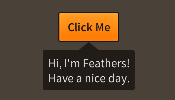
See the Hello World example running live in your browser. Requires Adobe Flash Player.
Walkthrough
Below, you'll find the basic structure of the Main class that we'll use as the root Starling display object. This walkthrough assumes that you already know how to initialize Starling. You may look through the example's full source code to see how this is done.
package feathers.examples.helloWorld
{
	import feathers.controls.Button;
	import feathers.controls.Callout;
	import feathers.controls.Label;
	import feathers.themes.MetalWorksMobileTheme;

	import starling.display.Sprite;
	import starling.event.Event;

	public class Main extends Sprite
	{
		public function Main()
		{
			this.addEventListener( Event.ADDED_TO_STAGE, addedToStageHandler );
		}

		protected var button:Button;

		protected function addedToStageHandler( event:Event ):void
		{
		}
	}
}
In our Main class, most of the code that we add later will go into the addedToStageHandler() function.
Let's start by initializing a theme. By default, the Feathers components don't have skins. However, several example themes are included with Feathers to easily provide sample skins to all components. A theme can be instantiated in just one line of code.
new MetalWorksMobileTheme();
The theme listens for certain events on the display list to detect when a new Feathers component is added. When a new component is added, the theme will create appropriate skins, including backgrounds, icons, text formats, and skins for sub-components, and pass them in automatically.
MetalWorksMobileTheme. This is a sample theme that provides pre-made skins for Feathers components. You can find it in the themes directory of the the Feathers ZIP file. Add MetalWorksMobileTheme.swc to your project's build settings the same way that you added feathers.swc.
With the theme created, let's create the Button and set it's label:
this.button = new Button();
this.button.label = "Click Me";
this.addChild( button );
If we want to do something when the button is tapped or clicked, we should listen to the Event.TRIGGERED event.
this.button.addEventListener( Event.TRIGGERED, button_triggeredHandler );
Our listener function should look something like this:
protected function button_triggeredHandler( event:Event ):void
{
	const label:Label = new Label();
	label.text = "Hi, I'm Feathers!\nHave a nice day.";
	Callout.show( label, this.button );
}
This triggered listener displays a Label, a generic component for displaying text, in a Callout component. Like with our button, these two components are automatically skinned by the theme.
Finally, let's position the button in the middle of the stage. First, though, let's take note of one thing about how Feathers controls work. Feathers uses a system of invalidation that delays redraws until just immediately before Starling renders to the screen. This keeps Feathers from using too much CPU by redrawing over and over again when you need to change multiple properties all at once.
At this moment, our button still has width and height values of 0 because it hasn't drawn yet. Feathers controls automatically resize themselves to an ideal size when they redraw (unless you explicitly set your own width and height values). This is usually based on the original dimensions of the skins and other children.
In this case, we want to position our button immediately, without waiting for validation. To make a Feathers control draw right now, call the validate() function:
this.button.validate();
Now, we can properly center our button on the stage because it will correctly report appropriate dimensions based on the size of the button's skin and label:
this.button.x = (this.stage.stageWidth - this.button.width) / 2;
this.button.y = (this.stage.stageHeight - this.button.height) / 2;
Conclusion
That should get you started with the very basics of working with Feathers. For more information about the capabilities of the Button class, read How to use the Feathers Button component. For the Callout class, read How to use the Feathers Callout component.
For more extensive sample code, check out the other Feathers examples included in the examples directory when you download Feathers. For example themes (including MetalWorksMobileTheme), check out the themes directory.
For more tutorials, return to the Feathers Documentation.
