Table of Contents
Customize UI components with Starling Builder
Sometimes the built-in Starling Builder components and configs do not satisfy what you need, it's easy to customize it.
Customize component properties with config change
If you want to add a property into the property UI, or add some new UI components that's already linked into the editor, you don't need to recompile the app. All you need is to change a config file.
Open Workspace menu and click on edit template, the editor_template.json will open for you. It's located in YOUR_WORKSPACE/setting folder.
When you are done editing it, you need to restart Starling Builder to see the changes
When a new version is upgraded, the editor_template.json may be overridden by a new one. So it's a good idea to make a backup with the config file to preserve your changes.
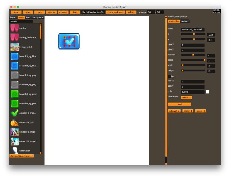
Here's an example of adding the blendMode property to Image
{
    "cls":"starling.display.Image",
    "params":[
        {"name":"width", "component":"slider", "min":1, "max":2000, "step":1},
        {"name":"height", "component":"slider", "min":1, "max":2000, "step":1},
        {"name":"scaleX", "step":0.01, "default_value":1},
        {"name":"scaleY", "step":0.01, "default_value":1},
        {"name":"color", "component":"colorPicker", "default_value":16777215},
        {"name":"blendMode", "component":"pickerList", "options":["auto", "screen", "normal"], "default_value":"auto"}
    ],
    "constructorParams":
    [
        {"cls":"starling.textures.Texture"}
    ],
    "tag":"asset"
}
Create custom UI components with runtime library
If the UI components you want to use are not supported by Starling Builder, you can compile them into a swf file and drop them into YOUR_WORKSPACE/libs folder
Here's how it works
- Open the https://github.com/yuhengh/starling-builder-extensions project, you can find a build configuration named components.
- This is an sample project that compiled the awesome PixelMaskDisplayObject http://wiki.starling-framework.org/extensions/pixelmask into the swf.
- Feel free to add as many custom UI components as possible and compile them into the swf.
- Drop the EmbeddedComponents.swf into YOUR_WORKSPACE/libs folder
- Make sure to click on Workspace menu → delete template override, and reload the editor to make it work
When you add a new custom UI component, you need to complete 3 steps.
- Write the custom UI component class
- Write the config in custom_component_template.json
- Link the class to EmbeddedComponents.linkers
For more information you can take a look at the implementation of PixelMaskDisplayObject as an example.
You can also checkout List of official Custom UI Components
Editor Template Reference
Top level
| name | description |
|---|---|
| supported_components | Official components and its properties supported by the editor |
| custom_components | Custom components and its properties supported by the editor |
| default_component | common properties of any UI components |
| background | Properties for background |
| version | version number of the template |
| revision | revision number of the template, when there's any changes in the template, this number will increase, and the editor_template in the workspace will be overridenn |
Inside supported_components or custom_components
| name | description |
|---|---|
| cls | full qualified name of the UI component class |
| params | editable properties of the component, in addition to default_component.params |
| createButton | whether create button will show up below the picker list |
| container | whether the component can be a container of other components |
| tag | what tab the component belongs to on the left, can be either asset, text, container or feathers |
| createComponentClass | a full qualified class name of a class which will show up before creating the UI component |
Inside params
| name | description |
|---|---|
| name | name of property |
| component | component of the inspector, for the time being the following components are supported: textInput, textArea, slider, check, pickerList, colorPicker, popup |
| cls | whether the component is a class or a simple type |
| disable | whether the textInput is disabled |
| default_value | default value of the parameter in code. If the current value is equal to default value, then it won’t be saved to the layout file |
| editPropertyClass | full qualified class name when the edit button is triggered, only usable when component set to “popup” |
Testing UI Component
Sometimes it’s not very convenient to build the swf, place it to the workspace and test it with the editor. In this case, use the test app inside tests folder to test it. You can simply replace the placer holder image with your own ui component and test it by launching the app.

