Table of Contents
Customize UI components with Starling Builder
Sometimes the built-in Starling Builder components and configs do not satisfy what you need, it's easy to customize it.
Customize component properties with config change
If you want to add a property into the property UI, or add some new UI components that's already linked into the editor, you don't need to recompile the app. All you need is to change a config file.
Open Workspace menu and click on edit template, the editor_template.json will open for you. It's located in YOUR_WORKSPACE/setting folder.
When you are done editing it, you need to restart Starling Builder to see the changes
When a new version is upgraded, the editor_template.json may be overridden by a new one. So it's a good idea to make a backup with the config file to preserve your changes.
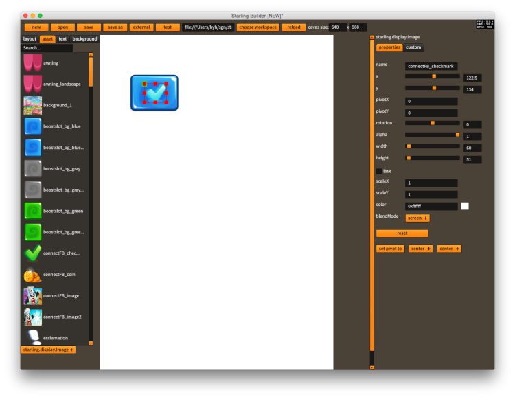
Here's an example of adding the blendMode property to Image
{
    "cls":"starling.display.Image",
    "params":[
        {"name":"width", "component":"slider", "min":1, "max":2000, "step":1},
        {"name":"height", "component":"slider", "min":1, "max":2000, "step":1},
        {"name":"scaleX", "step":0.01, "default_value":1},
        {"name":"scaleY", "step":0.01, "default_value":1},
        {"name":"color", "component":"colorPicker", "default_value":16777215},
        {"name":"blendMode", "component":"pickerList", "options":["auto", "screen", "normal"], "default_value":"auto"}
    ],
    "constructorParams":
    [
        {"cls":"starling.textures.Texture"}
    ],
    "tag":"asset"
}
Create custom UI components with runtime library
If the UI components you want to use are not supported by Starling Builder, you can compile them into a swf file and drop them into YOUR_WORKSPACE/libs folder
Here's how it works
- Open the https://github.com/yuhengh/starling-builder-extensions project, you can find a build configuration named components.
- This is an sample project that compiled the awesome PixelMaskDisplayObject http://wiki.starling-framework.org/extensions/pixelmask into the swf.
- Feel free to add as many custom UI components as possible and compile them into the swf.
- Drop the EmbeddedComponents.swf into YOUR_WORKSPACE/libs folder
- Make sure to click on Workspace menu → delete template override, and reload the editor to make it work
When you add a new custom UI component, you need to complete 3 steps.
- Write the custom UI component class
- Write the config in custom_component_template.json
- Link the class to EmbeddedComponents.linkers
For more information you can take a look at the implementation of PixelMaskDisplayObject as an example.
You can also checkout List of official Custom UI Components
Editor Template Reference
Top level
| name | description |
|---|---|
| supported_components | Official components and its properties supported by the editor |
| custom_components | Custom components and its properties supported by the editor |
| default_component | common properties of any UI components |
| background | Properties for background |
| version | version number of the template |
| revision | revision number of the template, when there's any changes in the template, this number will increase, and the editor_template in the workspace will be overridenn |
Inside supported_components or custom_components
| name | description |
|---|---|
| cls | full qualified name of the UI component class |
| params | editable properties of the component, in addition to default_component.params |
| createButton | whether create button will show up below the picker list |
| container | whether the component can be a container of other components |
| tag | what tab the component belongs to on the left, can be either asset, text, container or feathers |
| createComponentClass | a full qualified class name of a class which will show up before creating the UI component |
Inside params
| name | description |
|---|---|
| name | name of property |
| component | component of the inspector, for the time being the following components are supported: textInput, textArea, slider, check, pickerList, colorPicker, popup |
| cls | whether the component is a class or a simple type |
| disable | whether the textInput is disabled |
| default_value | default value of the parameter in code. If the current value is equal to default value, then it won’t be saved to the layout file |
| editPropertyClass | full qualified class name when the edit button is triggered, only usable when component set to “popup” |

